Product Solution
I collaborated with the product owner, engineering leads of iOS & Android, and user researchers on this project.
Through research, I learned that Citizens Bank’s competitors, like Chase and Santander Bank, all have Quick Links options on their mobile app. They provide the customers a shortcut to have direct and quick access to common actions.
I brainstormed some low-fidelity wireframe ideas and discussed with the senior designers to see if the design fits into our current design system and which gives the best result.

We decided to go for the first option, 4 small buttons in one row. The second option has too many options and it would overwhelm the users. Also, in option 2-4, the icons take up too much screen space, which leaves less room for the other content.
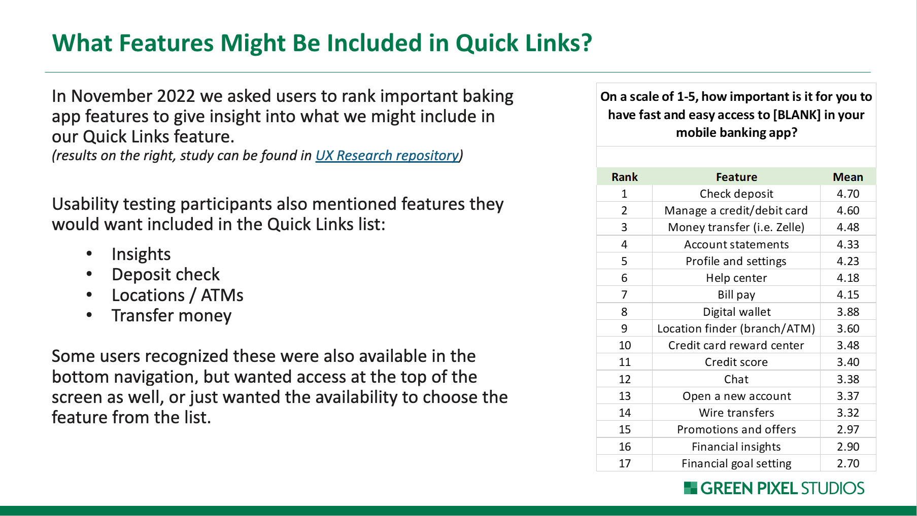
I also worked with the UX researcher to ask users to rank the important banking app features to give us insight into what we might include as possible Quick Links. We got the ranking of 17 features from our users.

High-fidelity design
I mocked up the high fidelity design. A pencil icon on the left indicates the user can go to the management page to edit the quick link choices. When the user clicks on the pencil icon, it will lead to the “Manage Quick Links” page. The user can choose whether to show quick links by toggling the button on the “Show Quick Links” row. They can select at most 4 quick links to show on the landing page and rearrange the quick link order by dragging the rows.
“Manage Quick Links” looks similar to the “Control Center” in iPhone Settings, so users would immediately understand how to use this page.
When more than 4 quick links are selected, a banner message will be shown to tell the user they cannot add more links.
Added snack bar and banner messages
Snack bar messages sliding from the bottom are shown when the user toggles “show quick links” to indicate “The Quick Links are On” and “The Quick Links are off”.
Moreover, an error message is shown on the top when the changes cannot be saved due to backend issues.


